Chicago Tribune, June 18, 1933
That Chicago’s great World’s Fair is a “milk and water” affair so far as its color scheme goes is the last thing the average visitor will admit. And yet, despite the flamboyant hues that greet the eye, it’s true. A Century of Progress is literally drenched with vivid hues that have as their basic elements milk and water.
Ask ten per persons what impressed them most at the Fair and probably nine will reply “the colors.” A few may object to their loudness, but the vast majority of visitors react enthusiastically to Joseph Urban’s gorgeous palette of dashing shades. But we doubt if even one out of every ten thousand who knows and admires the Urban color scheme has any idea of what the paints really are or who invented and made them.
Chicagoans Beats the World.
A black haired, dark eyed young Chicagoan, born in Spain, who has achieved considerable fame in the art world through his paintings, beat the rest of the world in the race to secure the contract to supply the World’s Fair colors. He is Ramon Shiva, who lives at 1311 North Dearborn street with his Virginian wife, and who has a paint factory in a small and ancient structure tucked away in 433 Hein place.
In this tiny establishment 10,000 gallons of vivid paints has been manufactured by a secret process and are now being seen by the world at A Century of Progress on the glowing structures which have made the great Fair probably the most colorful group of buildings in the world today.
These paints are made up of 20 per cent of casein (from skim milk), lime, pigments, considerable water, a little oil, and some chemicals. It produces an absolutely flat paint that won’t fade or peel, though it will eventually wash off.
Urban Hasn’t Seen Color Scheme.
Joseph Urban, who was paid a large sum by the Fair to have charge of the color scheme, sent out a pallet of hues, twenty-one for exteriors and thirty for interiors, Mr. Urban, ironically enough, has never seen his color scheme carried out. He has been in a New York hospital for some time and hasn’t been to Chicago in more than a year and a half.
Ramon Shiva, along with all the leading paint makers of the world, submitted a series of panels on which were samples, the colors Mr. Urban designated. Last August these panels were placed on a south wall of the Electrical group and kept exposed to the sun until a few months ago. Shiva’s colors were the only ones that stood the test satisfactory.
His company, called the Laketine corporation, of which he is president of, got the contract.
Mr. Urban believes in vicid colors and they must be in flat tones and fadeless. That apparently couldn’t be achieved in ordinary oil paints. The skim milk paints of Mr. Shive are flat, they’re vivid and seem to be fadeless. When they thicken, as all paints do, they’re thinned with water instead of oil.
Try Different Colors.
All of the World’s Fair buildings, however, have a priming coat of 13,000 gallons of oil pain made by the American Asphalt company. Over this is put a coat of the skim milk paint. In some instances several coats have been put on i order to achieve the desired color scheme.
The Administration building has been painted first in one bright color and then another until the present effect was secured. The Travel and Transport building also has had its costume changed as often that motoirists used to bet on what the next color scheme would be.
Others identified with Mr. Urban in the development of his color scheme at the World’s Fair are Otto Tegan, who represented him on the ground, and Shepard Vogelgesang, who has supervised the interiors.
Mr. Shiva achieved considerable attention in the art world several years ago when he announced the discovery and put on the market a palette of brilliant oil paints for artists.
The American Asphalt Paint company, who supplied the priming coat of oil paint used at the World’s Fair under the hues of Ramon Shiva’s milk and water colors, produced the following brochure.
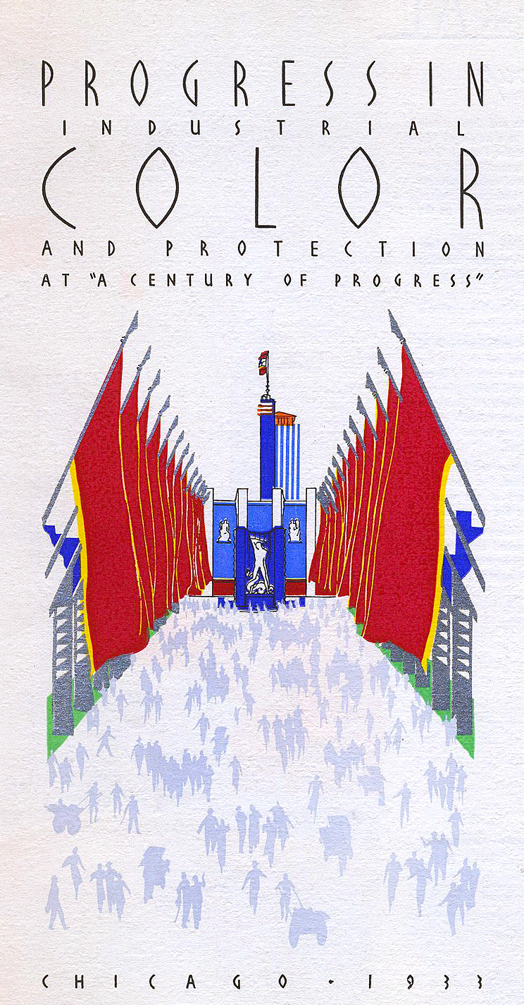
“A Century of Progress” was undoubtedly the beginning of a new era of more intelligent use of color for both home and industry. Twenty-eight distinct colors were selected with which to decorate “A Century of Progress.” The masterful handling of these colors, directed by the late Joseph Urban, created an expanse of beauty never seen anywhere. Note the distinct color schemes for individual buildings, as shown in the pages of this book, which when combined produce a panorama of color harmony never before witnessed by the human eye on such a tremendous scale! Color is important to our life and industry, but the correct use of of it is of more consequence. Color is reactionary. When used intelligently, it can induce happiness instead of sadness. It can produce alertness or drowsiness, comfort or discomfort, perfect vision or indistinctness. Because of appearance and shape, color can be lost to sight, and the result is a cloudy effect, one of obscurity and darkness, instead of clarity and vision. Color amuses, fascinates or annoys, inspires or disheartens, excites or repels, exaggerates or undervalues. Yes, a color scheme can even determine to some degree the failure or success of production, product, or a business.
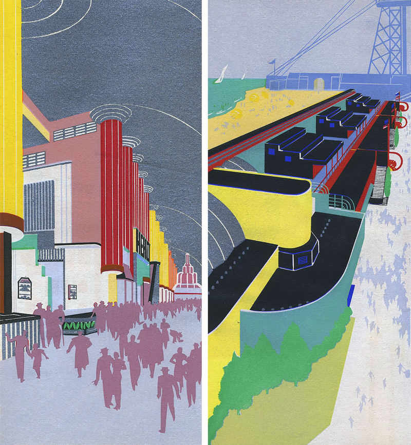
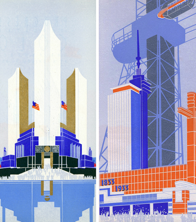
It may interest you to know a few of the interesting facts about this gigantic “color and production” assignment given us by “A Century of Progress.” It was the largest single paint contract of its type ever awarded. It was our responsibility not only to manufacture and supply these “VALDURA” paint products to match Mr. Urban’s difficult palette, but also to apply the “color and protection” to over 10,500,000 square feet of surface. This required the services of as many as 350 skilled painters a day. The first undercoats of VALDURA ASPHALT ALUMINUM PAINT were applied during the late months of 1932 to serve as protection for the surfaces through the severe, cold, icy, wet, winter months. The high corrugated fence alone has over 236,500 square feet protected with VALDURA ALUMINUM, and 78,500 square feet additional with VALDURA Oil Paints. The Sky Ride alone has 1,200,000 square feet of metal siding, in addition to 2948 tons of steel construction protected with VALDURA ALUMINUM and VALDUTA Oil Paints. As final color coats, more than 23,000 gallons of VALDURA Oil Paints and Casein were used. The flat color effecr were especially designed to conduce the gala colored lighting effects which made the nights at this Fair so outstandingly spectacular. Not alone the exterior, but also the magnificent interiors were a notable achievement in the use of decorative color. Even many of the murals created by world-famous artists were painted with VALDURA Oils. Truly, the “Century of Progress” was the world’s greatest paint task.
At “A Century of Progress” we were required to finish most every type of surface, many known as resistant to usual paint coatings. The exquisite interiors of many model homes, the steel of the 628-foot high towers of the Sky Ride, and smooth surfaces of galvanized iron or composition boards, subjected to sun, rain, heat and lake waterfront conditions.
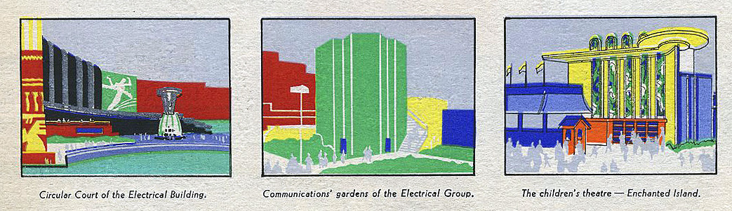
- Left to Right: Circular Court of Electrical Building, Communications’ Garden of the Electrical Group, The Children’s Theatre—Enchanted Isle
American Asphalt Paint Co.
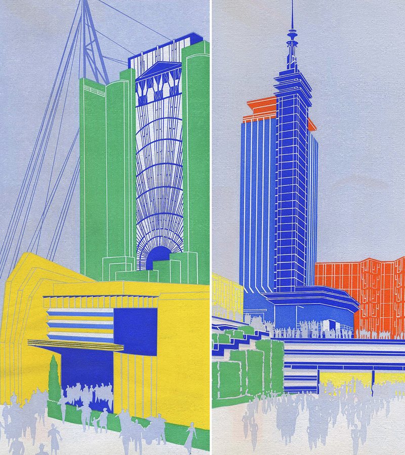
- Travel and Transport Building and Hall of Science
American Asphalt Paint Co.
- Agriculture Building
American Asphalt Paint Co.
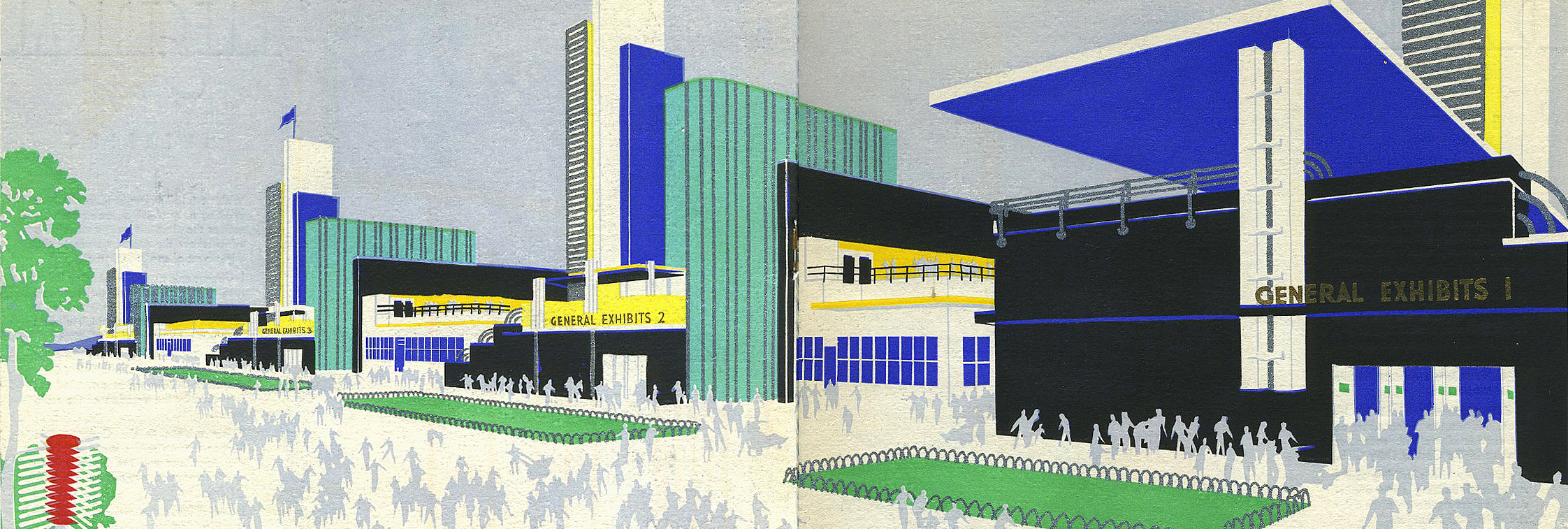
- General Exhibits Group
American Asphalt Paint Co.
- Federal Building and Sky Ride
American Asphalt Paint Co.
Leave a Reply